More Detailed Adjustment and Explanation of Brightness and Contrast
Let us explain the logic behind the mentioned adjusting procedures.
You must understand that it is somewhat hard to write a single adjusting procedure that will work on every LCD monitor. While concerning only peculiarities of multitude of panels that are available on the market, it would be a hard job. But what is worse, LCD monitor manufacturers are often 'cheating' with brightness and contrast controls, which don't do what they are supposed to. That's why the instructions might be complex.
On the other hand, given that your room is properly illuminated, and given a high-quality monitor, you might find mentioned instructions easy to accomplish, or even that image produced by your monitor delivers satisfactory results for many different settings.
The brightness control should change intensity of black and white, and all other shades of gray by a constant factor. The most correct way for a monitor manufacturer to accomplish this is to make brightness control affect the backlight. And that isn't always the case.
The contrast control should affect the brightness of the white color without affecting the brightness of the black color (and the rest of the grayscale should be affected linearly). This is usually accomplished by a digital processor which reduces the output signal when the contrast is set to less than 100%, so that crystals don't pass all the light through.
The usual way to cheat on contrast control is the following: Instead of making the processor reduce the signal when contrast is set to less than 100%, the signal is reduced when contrast is set to less than 50%. But then what should the monitor do when contrast is set to more than 50%? Easy... instead of making the white color brighter, processor makes upper part of grayscale whiter with a part of grayscale having the all the same white color. Which might appear to average user as an increase in contrast, but in fact it is just reducing the picture quality. This is called 'clipping the white'. Note that not all manufacturers cheat.
In some cases, monitor manufactures will opt for 'clipping the black' (since dark colors are hard to produce correctly), or to show incorrect dark colors.
Another factor is the quality of coating. The coating (matt or glossy) is there to reduce the amount of light reflected from the panel. If the coating is not good enough, it will reflect too much ambient light back to your eyes. In this situation you will not be able to distinguish between the dark colors because the reflected ambient light overwhelms the light emitted by your monitor when displaying the dark colors. Too much ambient light can overwhelm the image produced by your monitor, so the recommendation is to be reasonable with amount of illumination in your room.
The glossy coatings usually reflect less light, but they have the disadvantage of producing mirror-like reflections which can be disturbing to your eyes. For most uses we would recommend matt coatings.
So given everything said so far, here is what should be done to get the best image quality on your monitor:
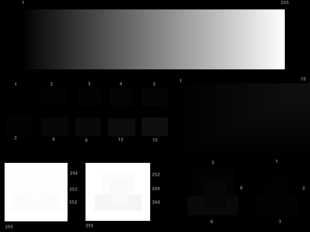
The bright feature in the bottom middle of the test image should be distinguishable. This ensures that white is not clipped.
The dark feature in the bottom middle of the test image should be distinguishable. This ensures that black is not clipped, and that dark colors are not overwhelmed by ambient reflections.
The room illumination should be set to a proper level. For office work and surfing, we recommend brighter illumination (but not the sunlight) because it is less demanding for the eyes. And the opposite for movies. Darker room will stress your eyes more, but movies last only 2 hours, and it might be more important to immerse in the movie than to make it easy for the eyes. For surfing and programming try medium-high illumination. For picture editing and gaming we recommend medium illumination.
Contrast should be set as high as possible but while still keeping the brightness of white on a comfortable level. For movies, this is as high as possible. For office work, we recommend as bright as sheet of paper. For other uses... well, you choose what is comfortable to you. And what was said in point 1 must still hold.
Brightness control should generally be set as low as possible, while still holding on to what was said in point 2.
The monitor should have correct gamma exponent (not covered in this article)
The white point should be set correctly (less important for most uses and not covered in this article)
A few notes about image quality of your monitor:
A quality monitor in a dark room should display all the rectangles in the middle left of the test image. Furthermore, the rectangles should not have different colors. Also, the rectangles numbered 1 and 2 should not be easily observable or should not be observable at all (but they must be displayed which can be verified by looking at the monitor from the side).
A quality monitor in a dark room should display the gradient in the middle right without any color changes in the gradient. If you have good eyesight, you should be able to distinguish all 15 bands when the brightness of the monitor is increased. No band should be more prominent than the others.
With a quality monitor in a dark room, the rectangles in the middle left of the test image should not change in intensity when looking at the monitor from various angles. Or, more realistically, the intensity won't change too much.
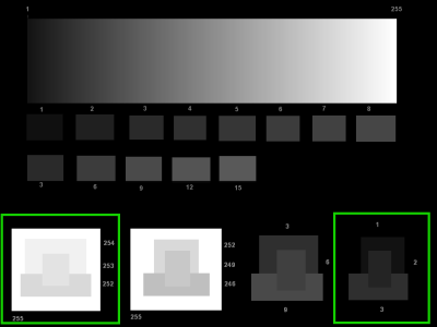
Now, for the folks with a keen eye and professional quality monitors: instead of looking at dark and bright features in the middle bottom of the test image, try the adjusting procedure using features on the sides! (In the image on the right, marked in green). A dark room is highly recommended.
Those features are much finer, and most inexpensive monitors will not be able to display them.
Copyright Kresimir Cosic 2008.