
Adjusting Brightness and Contrast on LCD monitors
Everyone who works at the computer for more than 3 hours a day can strain his eyes, especially if the monitor is not properly adjusted!
Prolonged staring at your monitor can hurt your eyes if it is not properly adjusted!
 Adjusting the monitor will also lead to more pleasurable and crisper images whether surfing the web,
writing a letter, playing a game or watching a movie!
Adjusting the monitor will also lead to more pleasurable and crisper images whether surfing the web,
writing a letter, playing a game or watching a movie!
Adjusting the monitor should be easy and straightforward, provided that you are supplied with a proper test image. Such an image will be given below together with the necessary explanations on how to adjust brightness and contrast controls.
We should also mention that we were surprised by the multitude of ill recommendations and outdated, flawed test images and procedures that we found elsewhere on the web. We assure you that, given our best knowledge, the instructions below represent the most accurate and simple way of adjusting your LCD (thin-panel) monitor.
Contents
- 1. Test image explanation
- 2. Adjusting for office use (Word, Excel, surfing the Internet)
- 3. For optimal picture quality (movies, games, pictures)
- 4. How good is your LCD monitor?
- 5. Why different settings for office use and for optimal picture quality
1. Test image explanation
So, let's get on with it! Below, on the left, is the test image which should be used to adjust brightness and contrast. It is likely that your monitor is not well adjusted at this point, so at this moment you will not able to see all the features present in the image. On the right is the same image with all the features grossly enhanced, so that they can be observed even with a completely unadjusted LCD monitor.
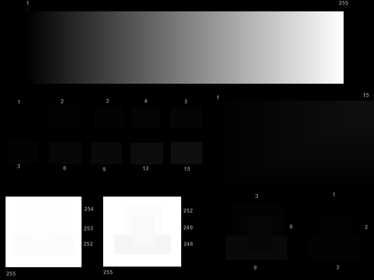
You can click on the image to view it in your browser. The left image is the test image! There is a slightly better way for viewing this image, if you have enough knowledge to do it: download the image to your computer and view it using an image viewer (like: IrfanView) in full screen mode.
Before starting, we would advise you to disable any image-enhancing option on your monitor (like: 'MagicBright' on Samsungs, MagicColor, ImageEnhancer or whatever. Your monitor should be set to something like: sRGB colors, normal mode (DV mode, Image mode) ).
And there is something you should do first, which will immediately enhance the monitor image quality and make better results: Clean your monitor! Use soft wet clothes for cleaning the panel.
2. Adjusting for office use (Word, Excel, surfing the Internet)
The most important factor in this situation it to keep overall brightness of your monitor at a comfortable level. For a well-light office, this is usually the same level of brightness as the brightness of a sheet of white paper. We will call this level of brightness 'comfortable brightness'.
If there is a lot of light in your room, as when the light is coming through the windows, then you might settle to a somewhat darker level of brightness.
Start any program that contains the white background (like: empty document in Notepad or Word). Initially, set the brightness control on your monitor to 0%. Take a sheet of white paper and place it next to your monitor. Then, change the contrast control on your monitor up to at most 50% until you reach your 'comfortable brightness', that is: the white background on your monitor is approximately as bright as the sheet of white paper next to it. If the monitor is still too bright or too dark, then also use the brightness control until the brightness of the monitor and the paper sheet match. Don't worry if the color of the paper doesn't match with the monitor's background. The color is not important here, only the brightness.
If your environment illumination is too dark, you might not be able to accomplish the above step. But for office use and surfing, it is recommended to keep your environment bright, so turn on some lights!
Then, observe the test image. In the middle, there are two rectangles marked with numbers 5 and 15. The goal is to make those two rectangles clearly different in intensity. But, at the same time, the monitor should keep the 'comfortable brightness', meaning that white background in Notepad should still be as bright as the sheet of paper next to the monitor.
To accomplish this, play with brightness and contrast controls. We recommend changing the brightness and contrast controls in opposite directions: First try to decrease brightness control as much as possible, and increase the contrast by approximately the same amount and see if that makes rectangles numbered 5 and 15 clearly distinct.
Remember that it is more important that your monitor's overall brightness remain at the 'comfortable brightness' level. Changing brightness and contrast controls simultaneously and in opposite directions should keep you about there, but do check with Notepad and the paper sheet.
If intensity of the illumination in your room changes, for example when night falls, you should re-apply the procedure to keep the monitor's overall brightness at a level that is comfortable to your eyes. If your monitor has the ability to remember its settings in a user-defined profiles, this feature might prove to be very useful here.
For laptops
If you are working outdoors a lot, increase the brightness while outdoors. Your battery might suffer a bit, but battery is rechargeable while your eyes aren't.
2. For optimal picture quality (movies, games, pictures)
The following setup is appropriate for viewing pictures, playing games containing high-quality graphics, and, with a slight adjustment, for movies.
Basic contrast adjustment
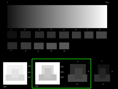
First, let's attempt to adjust the contrast. At the middle bottom of the image, there are two test features (the bright one on the left and the dark one on the right) consisting of several rectangles. It is quite possible that, there, you can't see what you ought to. We will mark the two test features on our enhanced image on the right, so that you know what we are talking about.
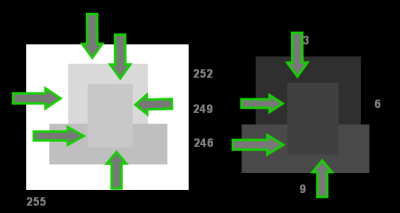
On this feature, there are some edges, which, at this moment, might not be noticeable to you. In the image to the right, the most important edges are pointed at by green arrows.
You should adjust the contrast until all the edges are visible to you, and you can see all the rectangles. The edges and rectangles will not be as visible as on our enhanced picture, they will be barely visible. If you can see how big the rectangle is, that means that you can see its edges. Also, don't just glance over dark and bright feature, give your eyes some time to adjust. When looking at the dark feature, gaze at it for some time so that your eyes can get accustomed to low light levels. And the same advice goes for bright feature. (Note: you should be looking at our test image, not at the enhanced version given here!)
Don't move your head around! Keep it straight in front of the monitor!
Here are some more detailed instructions: first, try to adjust the dark feature (on the right). You can do this by increasing the contrast. Perhaps you will need to increase the contrast to 100%. And, if even that doesn't help sufficiently, try increasing brightness until you are satisfied with the result on the dark feature.
This will probably make bright feature indistinguishable. Now, reduce the contrast until you can distinguish edges on the bright feature. If necessary, increase the brightness even more. Perhaps you will need to decrease brightness, but this is less likely, anyway, play around a bit. You should set the contrast so that you can distinguish edges on both the bright and the dark feature. Again, you might need to play with the brightness also, possibly by increasing it, perhaps even to 100%. On many LCD monitors, good results can be obtained by setting brightness to 50%. Anyway, the point is to find such settings where the edges are most easily distinguishable.
Ok, so let's say, that at this point, you have succeeded: Congratulations, you adjusted the contrast, now let's move on!
Basic brightness adjustment
How to adjust the brightness? Well, brightness control should be set depending on viewing conditions in your environment. If you are in a well light room, it should be set higher. If you are in a dark room, watching a movie, it should be set lower.
But, have this on your mind: LCD monitors have serious trouble displaying the black properly. And even worse, LCD monitor manufacturers, by default, tend to set the brightness control high, way too high! This is one of the primary reasons why your eyes can hurt: too bright monitor.
Now, reduce the brightness until you can barely see the edges on the dark feature.
If you have good and expensive monitor, you might want to keep the brightness at the level where you can see the edges more clearly.
What you have achieved at this point is an optimal picture on your monitor. So now, by following this guide, you can tell how good your monitor really is. Look at the gradient at the top of the test image. It should not have any bands, vertical or horizontal stripes, or grain. It should just be a smooth, linear gradient. If there are any defects in the gradient, think of buying a better monitor!
For watching movies
Aside from following the above procedure, it is recommended to increase contrast as much as possible, while still keeping distinguishable edges on both dark and bright feature. Also, it is recommended that you reduce the brightness as much as possible, especially if you are watching the movie in a dark room, brightness should not exceed 10%.
Even more details
Depending on the quality of your LCD monitor and illumination in your room you might find the above mentioned steps easy or hard to accomplish, or even that image produced by your monitor delivers satisfactory results for many different settings.
Additional instructions and explanations are available for those who wanting even more.
4. How good is your LCD monitor?
If you were unable to set brightness and contrast in such a way that all edges and squares are clearly distinguishable, than perhaps your monitor is not as good as it should be.
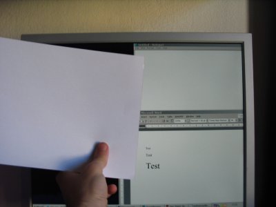
Now, some bad news. Most LCD monitors sold today are based on the so-called TN technology. Those monitors may have serious trouble displaying images correctly. Companies usually buy them for their employees because they are so cheap, and those monitors can display sufficiently good picture for working in Word and similar applications. TN monitors can be immediately recognized by the following test: Have some medium-bright photo-realistic picture displayed on the monitor (like: a photo or similar, but not too bright photo). Now look at the monitor from a bit below. If the top of the monitor turns darker, it is a TN. If you re working with a TN monitor, you will have trouble adjusting it using the procedure above, because of its bad picture quality. I would suggest that, if you can, you should buy a monitor based on PVA/MVA or IPS technology. PVAs and MVAs aren't so expensive anymore.
5. Why different settings for office use and for optimal picture quality
The basic problem is that, probably way back then when CRT monitors were used (the big, deep and heavy ones), they couldn't produce sufficient brightness. So, in order to counter this and get most out of CRT monitors, the software manufacturers decided to make background color of many applications bright, full intensity white!
But, today's LCD monitors are capable of super-high brightness, rivaling the daylight! They can make your eyes suffer! Full intensity white background, as is used in contemporary applications, means that LCD is showing you the brightest white that it can produce. Such an intensive white is suitable for displaying short movie scenes with explosions and such, but not for staring at it for 3 hours or more!
That is why, generally speaking, relative to environment illumination, the monitor should be much darker when working in office and similar applications, and brighter and more contrasted when viewing pictures and photorealistic graphics.
6. Conclusion
Well, we hope you will be satisfied with your new adjustments. For all the comments and suggestions, please write to
Additional instructions and explanations are available for those who wanting even more.
Have a crisp picture!
Use the search box below to find related content:
Copyright Kresimir Cosic 2008.